To add chromatic aberration in Krita, follow the following steps:
1: open the image you want to edit in Krita.
2: click on Filters -> Start G'MIC-Qt on the menubar. This should open G'MIC's interface as a dialog window.
Note: you need to have G'MIC installed to use this. If you are using Krita on Windows, it should be installed by default, but on Linux, it depends on your distro.
3: in G'MIC's interface, you'll find hundreds of filters available in various categories. The filter we want is Degradations -> Chromatic Aberrations. Once you select it, you should see a panel change to display its settings.
You can customize how strong the chromatic aberration effect is with these settings, and even which colors to use. By default, it uses red and green with an X, Y amplitude of 2. I think this means 2 pixels. This effect is going to be too subtle in most cases. You'll need to increase the amplitude a lot to see it, specially if you're working with a high resolution illustration and you want the effect to be visible in a 4x downsample that you're going to post on Instagram, for example.
By default, only the red color shifts. You may want to configure the other color to shift toward the opposite direction.
It's worth noting that although this shift is diagonal by default, some illustrations feature a horizontal shift instead.
It seems it's not possible to make this effect shift more than 32 pixels to either side. I may try to remake it using Krita filters one day so it's more customizable.
The Attenuation Near Center goes from negative 100% to positive 100%. Essentially it changes how strong the effect is in the edges compared to the center of the image. By default it's 0%, which means it shifts the same amount in all cases.
The Attenuation Decay changes how quickly the effect fades from the center.
Note: in the preview, the "center" is the center of the preview, which doesn't show the whole image, so the preview doesn't actually preview the actual effect of the filter on the image.

4: after you customized it to your liking, click "OK" to apply.
5: save your work.

G'MIC feels really limited for a number of reasons. It seems there is no way to zoom out? Only zoom in? It may be a good idea to apply the filter on a flattened, duplicated version of your work so you can easily compare it to how it looks with the effect applied.
Observations
Krita Limitations
This filter is only found in the menubar. It's not possible to add it as a non-destructive filter layer or filter mask currently. Which is unfortunate since the same is true for all G'MIC filters and there are literally hundreds of them.
G'MIC is an external program and can also be used in GIMP, so you could also add chromatic aberration in GIMP through similar steps provided that you have G'MIC installed, and GIMP's G'MIC plugin installed.
What is Chromatic Aberration?
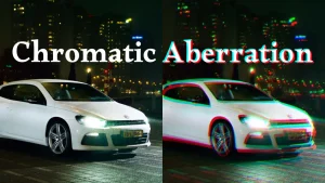
Chromatic aberration is an actual photographic phenomenon that occurs when a camera doesn't focus all colors on the same points, which means some colors will "shift" to one side or another. This happens when the material of the camera lens reflects different colors of light differently, creating a colored, blurry outline effect.
Naturally, you expect high quality cameras created with better materials to have less of an issue with this, but even cheap cameras won't have the exaggerated aberrations that some digital artists like to put in their work.

Observe above how a real chromatic aberration effect creates a "rainbow" effect on what should be white color. Digital effects typically only shift one or two colors to the side by a certain amount of pixels, while the real thing distorts the whole color spectrum.
TikTok
I noticed that TikTok's logo features this effect. I wonder if this contributes to its popularity?
Best for White Colors
This kind of effect only makes sense, physically speaking, if you have a white object. A black object can't create chromatic aberration, since black objects don't reflect light, so there is nothing to distort. TikTok's logo for example is mainly white. At first I tried using this filter with a darker image and the results were very poor.
Leave a Reply